Key elements of the role
Customer Experience Strategy | Research | Stakeholder Management | Stakeholder Workshops | Customer Research | Usability Testing | Wireframes | Interactive Prototypes
Introduction to VentureCrowd
VentureCrowd is an online investment platform that connects investors with high-growth startups and innovative projects. It allows users to invest in various asset classes, including equity crowdfunding, property, and debt. The platform aims to democratise investment opportunities, making them accessible to individual investors and entities.
Discover
Stakeholder workshops and user interviews I started by understanding the users' needs and pain points. I conducted stakeholder workshops with VentureCrowd's team to gather insights into their business goals and user expectations. User interviews helped me explore the experiences of first-time investors and seasoned entities.
Surveys and analytics review: I distributed surveys to a diverse group of current and potential users, asking about their investment habits, challenges, and expectations. Additionally, I analysed existing user data to identify patterns and common issues in the onboarding process.
Define
User Personas Based on my research, I developed user personas representing different investor types, from individual beginners to experienced entities. These personas helped me empathise with users and tailor the experience to their needs.
User Journey Mapping I mapped out the user journey with the support of the core product team, highlighting each step from initial platform discovery to completing an investment. This process revealed pain points and opportunities for improvement, particularly in the onboarding phase.
Ideate
Brainstorming workshops: I held brainstorming workshops with my design team, generating a wide range of ideas to improve the onboarding process. We focused on making the process intuitive, informative, and engaging for all user types.
Lean UX approach We applied the principles of Lean UX, emphasising collaboration, rapid experimentation, and continuous feedback. This approach allowed us to quickly test and validate ideas, ensuring we were on the right track without wasting time on unproven concepts.
Co-Design sessions In co-design sessions, I invited users to collaborate with us, sketching out their ideal onboarding experience. This direct user involvement ensured our concepts resonated with actual needs and preferences. The Lean UX approach facilitated this by promoting cross-functional teamwork and keeping the user at the centre of the design process.
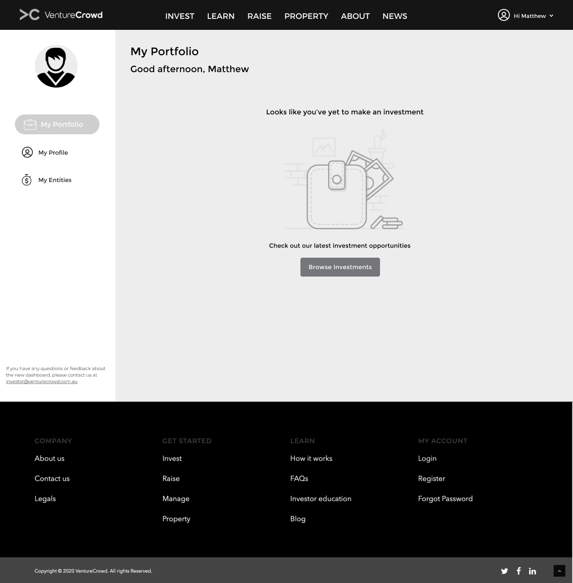
Onboarding screen for a new customer
Onboarding screen - welcoming a returning customer to their dashboard
Onboarding screen - advising returning customer of portfolio details
Mobile screens displaying the customers portfolio, from one investment to multiple investments and entities
Prototype
For low-fidelity prototypes, I created low-fidelity wireframes and mockups, focusing on the core steps of the onboarding process. These prototypes allowed us to iterate quickly based on feedback from stakeholders and users.
Interactive Prototypes We developed interactive prototypes to simulate the onboarding experience. These prototypes enabled users to navigate through the process and provide real-time feedback, helping us refine the flow and address usability issues early on.
My Profile screens moving from wireframes to interactive prototype
Test
Usability Testing: I facilitated and scripted the discussion guides for the usability testing sessions with individual investors. During the sessions, participants were asked to complete key tasks, such as creating an account, exploring investment options, and making an investment. Their feedback highlighted areas that needed further refinement.
A/B Testing To ensure our solutions were effective, I ran A/B tests comparing the new onboarding process with the existing one. To validate improvements, I measured metrics such as completion rates, time spent on tasks, and user satisfaction.
My Portfolio screen displaying personal investment and entities
A variant of the My Portfolio was tested, this version made the customer aware of other investment opportunities. Different versions of this concept was tested.
Learn
Feedback Analysis I analysed all feedback from usability tests and A/B tests, identifying trends and specific areas needing improvement. This analysis guided our final iterations, ensuring the onboarding experience was polished and user-friendly.
Continuous Improvement The launch of the new onboarding process was not the end. I established a continuous feedback collection and improvement system, allowing VentureCrowd to adapt and evolve with user needs over time.
The concept of light versus dark UI was tested.
Conclusion
The onboarding experience on VentureCrowd was completely revamped using a structured design thinking process. The revised onboarding process made it easier for customers to make individual investments and invest in entities, kickstarting their investment journey. By prioritising user needs and making iterative improvements, I ensured a user-centric approach aligned with VentureCrowd's mission to democratise investment opportunities.
Outcomes
Streamlined onboarding process through Lean UX principles
Enhanced user personas and journey maps tailored to investor needs
Improved user satisfaction and completion rates via A/B testing
Seamless integration of user feedback and continuous improvement
Successful implementation of user-centric design thinking methodology
Major achievements
• Successful launch of the onboarding process
• Excellent customer feedback
• Few interactions with support team regarding first time investors
Tools & tech stack
• usabilityhub.com
• surveymonkey.com
• Figma
• Miro
• Google Docs
• Keynote
• Pen & paper
• Apple Numbers
Client
VentureCrowd


